Sunday, 16 January 2011

Project Review

This project has been interesting with new challenges and new knowledge that I can take forward with me for the future. When I was given the opportunity to look at the two different briefs I had to choose from, I had to make a decision based upon my creative ideas and what I believed I could produce within the two sets of possible guidelines. The ID (IDENTIFICATION) brief immediately leapt out at me, as it provided me with more questions and I believed those questions could be explored and turned into possibilities, so this was the brief I chose to follow. I realised that my lack of understanding regarding the field of portraiture and art in general may be one of the reasons that I choose not to visit art galleries and this could also apply to a percentage of the general public. Some people may consider this lack of understanding to be ignorance but I do not believe that is a fair point of view. Knowledge empowers people and a sharing of knowledge can help individuals and bring groups of individuals together. In this case I decided that I wanted to create an application that would inform people about portraiture, provide them with knowledge that they can take forward to create their own opinions about works of art, in order to break down any potential barriers that may currently be preventing people from gaining enjoyment through art.

In order for me to do this, I had to research information about portraiture and I also had to look at ways of passing this information on to others. I looked at lesson plans for teachers, and current portraiture teaching initiatives, including one from the Smithsonian, thus helping me to gain an understanding of the field myself and helping me to see how to break it down into smaller chunks that can be used to teach potential users.

Through this project I have learnt a lot about portraiture and I think I have learnt about the delivery of information in some ways. In my project I have tried to inform users and I have tried to get users to ask questions themselves, in order to help them to continue learning. I hope that my application does inform potential users and I hope it will make a difference to at least one person, if it does then all of the work will have been worth it and I can consider my application to be a success.

I have not only had to learn about portraiture during this project but I have also had learn a new scripting language, this will be my first complete project using action script3. This has been a challenge in itself but I seem to have everything I wanted working, so I am pleased to say it is a challenge I feel I have conquered.

I have also had to put into practice the knowledge I gained in the past two years regarding kiosk application design, remembering the best practices in order to produce a user friendly design.

The interactive portrait part of the application was my attempt at showing how technology can now influence portraiture, although some artists may not consider it to be a portrait, I believe it fits the definitions of portraiture in my application very well:

  • It is a likeness of a group of people created by an artist
  • It will record the a point in history(The exhibition)
  • It will show different people engaging with art at the gallery

Although I am not picking up a paintbrush or a camera, It is still a considered, structured piece of interactive portraiture, that’s quality and merits will be open to the same debate as any other portrait but that is what art does, it creates emotional responses that are interoperated by different people, in differing ways. To various extents that why an application such as mine is so important, if it can inform, engage, entertain and record, it is fulfilling many of the potential facets of art as a medium.

I feel that I am not the strongest artistically and although I am happy with my design, I feel a stronger visual designer could have produced a better visual appearance for the application.

As with my client project last year I have been producing this piece on my own, as I am the only Interactive Multimedia student, so I have had to be researcher, designer, developer and project manger but the experience of last year has proven invaluable to me. Although I have worked on this project on my own, I have had great support from my lecturer James Field and I have been able to draw on the artistic knowledge of my client Adele Howitt, I would like take this opportunity to say thank you to them both for their support throughout this project.

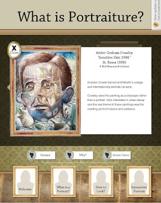
I have thoroughly enjoyed this project but I must admit I am glad it is over as looking at my screen sideways on was getting irritating but I am happy with the application I have produced and hopefully the client will also be happy. Please see some screen shots from the finished application below:




Friday, 14 January 2011

Stressful hand in

Today was the exhibition hand in so I printed out the required documentation, put the application onto a disc and decided to check it on my girlfriend’s laptop and it did not work. So I tried it on mine and it worked, I then tried it again on my girlfriend’s laptop and again it was not working, so the alarm bells started ringing. I rushed to my parents house to try it there and still no joy but my time was running out, on the way to hand it in I realised that the other two computers I had tried the application on did not have webcams and this could be the problem, so I left a note for my client informing her that the application needed testing on a computer with a webcam.

I later received an email from my client requesting pdfs of the application as it was not working, I contacted my client to see if they had used a computer with a webcam and they hadn’t, so I explained again that they needed to test it on a computer with a webcam and that if I sent pdfs the interactive content would not be working or shown to its full potential. My client then agreed to try it with a webcam and if they were any further problems said they would get back in touch with me, I’ve not heard anything else yet, so hopefully everything is okay. I hope this confusion has not damaged their potential feeling about my application.

Wednesday, 12 January 2011

No arrow

I just realised that although it may be better for there to be no mouse pointer on a touch screen application, there is a good chance that the client will be reviewing my piece using a mouse. I will have to produce two versions one that can be used with a mouse for review and marking purposes and one appropriate for touch screen use in the kiosk if my piece is chosen for the exhibition.

Monday, 10 January 2011

User Testing


Today I conducted user testing on my application and as usual I’m glad I did as it showed me a few areas for improvement, through user testing I found:

A capital letter that should not have been there, a wrongly labelled button, some text that was not aligned properly and extra space where it was not needed. These may seem like trivial errors but they can make the difference between a professional looking application and an amateur application. I also found a couple of other things worth talking about, one user noticed that the curser displays differently on a side due to our rotation of the screen and suggested using a custom curser, maybe a paintbrush. I considered this and realised that a touch screen application such as mine should not use a curser as it may provide confusion for users, a cursor makes the user think "How do I get the arrow to do what I want?" When really all they need to do is interact directly with the functionality of the application.

I also noticed that when the users where dragging the slider on the timeline a menu kept appearing, I have done some research and hopefully this issue may now be resolved.

User testing is always useful and should never be ignored, without user testing my application would have unresolved errors that I did not find on my own.

Saturday, 8 January 2011

Application Content

I have tried to take into consideration the varied levels of reading ability, subject knowledge and interest when writing content for my application. My client also wants me to add information about the particular pieces of work she wants me to feature and she has provided me with that content. I believe the content she has provided me with may be too intensive for younger users and it is written in a different style to the rest of the content but as she has the medium specific knowledge I will have to put it in. If this content had been provided at an earlier stage of production, there may have been time to negotiate a re-write of the information to try and improve its suitability.

Wednesday, 5 January 2011

Info and Close Button

Within my application I have been asked to feature paintings from the Ferens Art Gallery, with accompanying information about the paintings and the artists. The client suggested placing the information below the painting but this is not possible as there is simply not enough space to do this, so what do I do? I could paginate the ‘how to look’ information with a next button but I feel that would not be suitable as both sets of information should be kept separate, as they do not directly relate to one another. The solution I have come up with, is to hide the information about the portrait behind the portrait, this gives the user the ability to access the information without cluttering up the screen, whilst also adding an interesting bit of interaction.

Saturday, 1 January 2011

It’s the little things that can make a difference.

It’s the little things that can make a difference to a design, the drop shadows, the real life details that are not main features but add that little bit extra. I have tried to remember this in my application and here are some examples, when hanging a picture on a wall there are a number of ways of doing this, a nail that a string hangs on, a chain to a picture rail or the method I have used in my design, the frame bracket, see below:

I have used these on all frames and info boards.

The down light to illuminate the information adds a little bit of extra detail, see below:

I could have also used a down light above the pictures but I felt that was too much.