I just realised that although it may be better for there to be no mouse pointer on a touch screen application, there is a good chance that the client will be reviewing my piece using a mouse. I will have to produce two versions one that can be used with a mouse for review and marking purposes and one appropriate for touch screen use in the kiosk if my piece is chosen for the exhibition.
Wednesday, 12 January 2011

Monday, 10 January 2011
User Testing

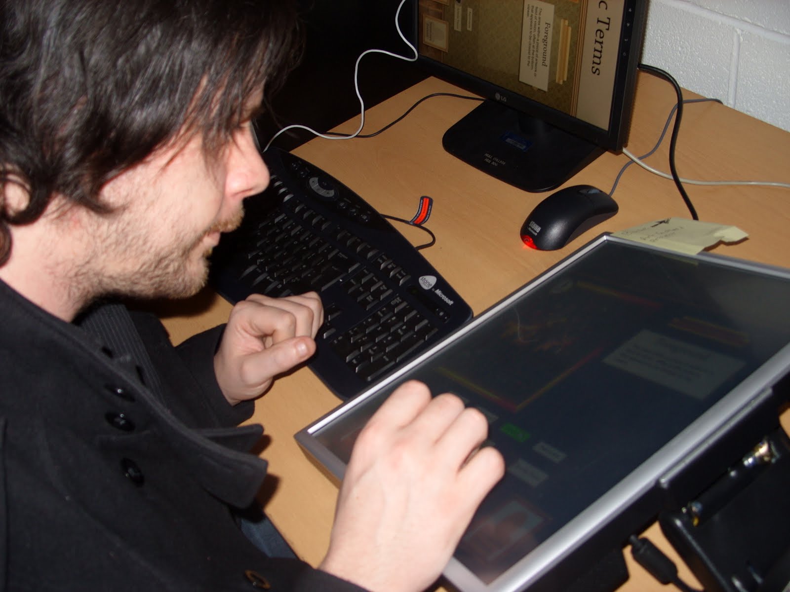
Today I conducted user testing on my application and as usual I’m glad I did as it showed me a few areas for improvement, through user testing I found:
A capital letter that should not have been there, a wrongly labelled button, some text that was not aligned properly and extra space where it was not needed. These may seem like trivial errors but they can make the difference between a professional looking application and an amateur application. I also found a couple of other things worth talking about, one user noticed that the curser displays differently on a side due to our rotation of the screen and suggested using a custom curser, maybe a paintbrush. I considered this and realised that a touch screen application such as mine should not use a curser as it may provide confusion for users, a cursor makes the user think "How do I get the arrow to do what I want?" When really all they need to do is interact directly with the functionality of the application.
I also noticed that when the users where dragging the slider on the timeline a menu kept appearing, I have done some research and hopefully this issue may now be resolved.
User testing is always useful and should never be ignored, without user testing my application would have unresolved errors that I did not find on my own.


Saturday, 8 January 2011
Application Content
I have tried to take into consideration the varied levels of reading ability, subject knowledge and interest when writing content for my application. My client also wants me to add information about the particular pieces of work she wants me to feature and she has provided me with that content. I believe the content she has provided me with may be too intensive for younger users and it is written in a different style to the rest of the content but as she has the medium specific knowledge I will have to put it in. If this content had been provided at an earlier stage of production, there may have been time to negotiate a re-write of the information to try and improve its suitability.
Wednesday, 5 January 2011
Info and Close Button
Within my application I have been asked to feature paintings from the Ferens Art Gallery, with accompanying information about the paintings and the artists. The client suggested placing the information below the painting but this is not possible as there is simply not enough space to do this, so what do I do? I could paginate the ‘how to look’ information with a next button but I feel that would not be suitable as both sets of information should be kept separate, as they do not directly relate to one another. The solution I have come up with, is to hide the information about the portrait behind the portrait, this gives the user the ability to access the information without cluttering up the screen, whilst also adding an interesting bit of interaction.
Saturday, 1 January 2011
It’s the little things that can make a difference.
It’s the little things that can make a difference to a design, the drop shadows, the real life details that are not main features but add that little bit extra. I have tried to remember this in my application and here are some examples, when hanging a picture on a wall there are a number of ways of doing this, a nail that a string hangs on, a chain to a picture rail or the method I have used in my design, the frame bracket, see below:

I have used these on all frames and info boards.
The down light to illuminate the information adds a little bit of extra detail, see below:

I could have also used a down light above the pictures but I felt that was too much.
Tuesday, 28 December 2010
Timeline Working Fine
The time line seems to working fine now with no lagging, I changed a couple of lines of code slightly and it seems to have done the trick. The problem with the buttons that were not working has also been resolved.
I have added the webcam part to the interactive portrait section, as yet it does not send the image to a database but I can now see how it fits in visually to the application
Wednesday, 22 December 2010
Slider Bar
Today I had the house to myself so I have been able to tack the timeline, I found a tutorial that uses a slider to control frames within a movie clip, you can find the tutorial here:
http://www.gotoandlearnforum.com/viewtopic.php?t=24015
The way it works in laymen’s terms is the code measures the length of a movie clip, in this case a slider bar, it then counts how many frames are in your movie clip and divides the length of the slider bar by the number of frames. It then links the position of the slider along the bar to the individual frames, so when the slider moves so far along the bar the movie moves to the next frame.
Firstly I stripped away the non relevant parts of the code, I then manipulated the code to control not only the frames within the movie clip but also frames on the main timeline and it seems to work but the slider is sticking a bit at first, once you get it moving it works fine.
On another note two of my navigational buttons are not working, I’m not sure why but I will investigate.
Subscribe to:
Posts (Atom)